Fields overview
Supported field types
Front Matter supports the following fields to be used in the content-types:
- string
- number
- datetime
- boolean
- image
- file
- choice
- list
- draft
- tags
- categories
- taxonomy
- fields
- fieldCollection
- block
- dataFile
- slug
- contentRelationship
- customField
There are also the following section fields:
Standard field properties
All fields share the following field properties:
| Property | Type | Description | Optional / Required |
|---|---|---|---|
name | string | The name of your field, will be used to set in the front matter of your Markdown file. | Required |
type | string | The type of the field. Use one of the supported field types. | Required |
title | string | The title to show in the metadata section | Optional |
description | string | The description to show underneath the field | Optional |
default | string | Defines the default value for the field when creating the content type. You can also use placeholders like {{title}}, {{slug}} or {{now}}. Check for more information under placeholders. | Optional |
required | boolean | Defines if the field is required or not. If set to true, and the user does not define a value, a notification will appear. You can disable this notification with the frontMatter.global.disabledNotifications setting. | Optional |
hidden | boolean | Specifies if you want to hide the field from the metadata section, but still have it available in Front Matter. | Optional |
actions | object | Defines the custom actions/scripts that you can execute to populate the field value | Optional |
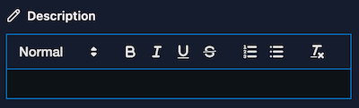
String
The string field type is used to store a single-line or multiline of text. For instance, you can
use if for the title, description, or any other text field.
Properties
| Property | Type | Description | Required | Default |
|---|---|---|---|---|
single | boolean | When set to true, the field will be rendered as a single line. | Optional | false |
wysiwyg | boolean, html or markdown | When set to true, the field will be rendered as a WYSIWYG editor and output HTML. You can also provide html or markdown its value to define the field's output. | Optional | false |
{
  "title": "Title",
  "name": "title",
  "type": "string",
  "single": true
}---
title: "My title"
---Number
The number field allows you to insert integer values, like for instance setting the weight of your
content.
Properties
To configure the number field, you can specify the following properties in the numberOptions
field property:
| Property | Type | Description | Required | Default |
|---|---|---|---|---|
min | number | The minimum value for the field. | Optional | |
max | number | The maximum value for the field. | Optional | |
step | number | The step value for the field. | Optional | |
isDecimal | boolean | When set to true, the field will allow decimal/floating values. | Optional | false |
Example 1
{
  "title": "Weight",
  "name": "weight",
  "type": "number"
}---
weight: 1
---Example 2
{
  "title": "Weight",
  "name": "weight",
  "type": "number",
  "numberOptions": {
    "min": 1,
    "max": 10,
    "step": 1
  }
}---
weight: 1
---Example 3
{
  "title": "Weight",
  "name": "weight",
  "type": "number",
  "numberOptions": {
    "isDecimal": true
  }
}---
weight: 1.5
---Datetime
The datetime field allows you to add date fields. You can use it for publish, modified, and any
other types of dates for you content.
Properties
| Property | Type | Description | Required | Default |
|---|---|---|---|---|
isPublishDate | boolean | Specifies if the field is a publish date. When set to true, the field will be used to set the publish date for the content (this will be reflected on the content dashboard). | Optional | false |
isModifiedDate | boolean | Specifies if the field is a modified date. When using the frontMatter.content.autoUpdateDate setting to automatically update the modified date of the article, this field will be used. | Optional | false |
dateFormat | string | Specifies the format of the date. By default it uses ISO format. | Optional |
InfoThe format of your date can be defined in the
frontMatter.taxonomy.dateFormatsetting (globally), or with thedateFormaton the field level. To format the date, use the date-fns formating for more information.
{
  "title": "Publishing date",
  "name": "date",
  "type": "datetime",
  "isPublishDate": true
},
{
  "title": "Last modified date",
  "name": "lastmod",
  "type": "datetime",
  "isModifiedDate": true
},
{
  "title": "Date formatting",
  "name": "dateWithFormat",
  "type": "datetime",
  "default": "{{now}}",
  "dateFormat": "yy-MM-dd"
}---
date: 2022-03-14T08:42:21.626Z
lastmod: 2022-03-14T08:42:22.364Z
dateWithFormat: 23-07-16
---Boolean
The boolean field can be used to set a value of true or false into your markdown. It will be
rendered as a toggle.
{
  "title": "Published",
  "name": "isPublished",
  "type": "boolean"
}---
isPublished: true
---Choice
The choice field allows you to define a set of options.
Properties
| Property | Type | Description | Required | Default |
|---|---|---|---|---|
choices | string[] or { id: string; title: string; }[] | Define the choices for the field. | Required | |
multiple | boolean | Define if you want to allow multiple choice selection. | Optional | false |
Example 1
{
  "title": "Choice",
  "name": "choice",
  "type": "choice",
  "choices": ["", "Choice 1", "Choice 2", "Choice 3"]
}---
choice: "Choice 1"
---Example 2
{
  "title": "Choice",
  "name": "choice",
  "type": "choice",
  "choices": [
    { "id": "1", "title": "Choice 1" },
    { "id": "2", "title": "Choice 2" },
    { "id": "3", "title": "Choice 3" }
  ]
}---
choice: "1"
---List
The list field allows you to add multiple text values.
{
  "title": "Alias",
  "name": "alias",
  "type": "list"
}---
alias:
- release-notes-v8
- changelog-v8
---Draft
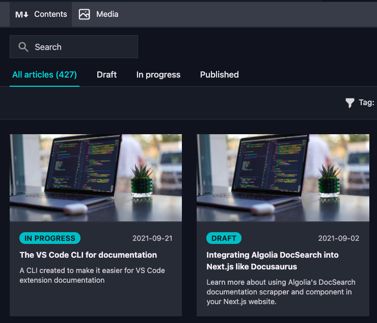
The draft field defines the state of your content. This is used for the content dashboard as well.
By default, the draft field is a boolean. If you want to use your own status values, you can
configure it via the frontmatter.content.draftfield setting.
When using a custom draft status, the content dashboard will make use of it as well:
ImportantIf you use Jekyll, you do not have to use the draft field, as Front Matter supports the
_drafts,_postsfolders and collections from Jekyll. If you use Jekyll, make sure to set thefrontMatter.framework.idsetting tojekyll.
Example 1
{
  "title": "Draft",
  "name": "draft",
  "type": "draft"
}---
draft: true
---Example 2
In case you want to use a published field, instead of a draft field. You can invert the logic by
setting the invert property to true:
"frontMatter.content.draftField": {
  "name": "published",
  "type": "boolean",
  "invert": true
}{
"title": "Published",
"name": "published",
"type": "draft"
}---
published: false
---Example 3
If you want to use your own status values, you can define it by specifying these in the
frontMatter.content.draftField setting:
"frontMatter.content.draftField": {
  "name": "draft",
  "type": "choice",
  "choices": ["draft", "in progress", "published"]
}{
"title": "Draft",
"name": "draft",
"type": "draft"
}---
draft: "in progress"
---Image
The image field can be used to reference single or multiple images to your content.
Properties
| Property | Type | Description | Required | Default |
|---|---|---|---|---|
isPreviewImage | boolean | Allows you to specify a custom preview image for your article. When you set this to true for an image field in your content type, it will be adopted in the dashboard. | Optional | false |
multiple | boolean | Define if you want to allow to select multiple images. | Optional | false |
ImportantYou can only set this on one image field per content type.
{
  "title": "Article preview",
  "name": "preview",
  "type": "image",
  "isPreviewImage": true
}---
preview: /social/400285cf-4928-4c07-8ca5-158f249a3bc1.png
---File
The file field can be used to reference single or multiple files to your content.
Properties
| Property | Type | Description | Required | Default |
|---|---|---|---|---|
multiple | boolean | Define if you want to allow to select multiple files. | Optional | false |
fileExtensions | string[] | Define the file extensions that are allowed to be selected. | Optional | [] |
{
  "title": "Attachments",
  "name": "attachments",
  "type": "file",
  "multiple": true,
  "fileExtensions": ["pdf", "mp4", "wav"]
}---
attachments:
- /uploads/file1.pdf
- /uploads/file2.mp4
---Tags
The tags field allows you to create or use tags from your .frontmatter/database/taxonomyDb.json file (by
default, none existing). When adding a tag which does not yet exist, you will have the option to
create it.
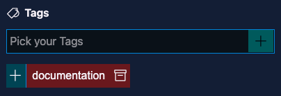
When the tag is created, you will be able to re-use it for other content.
InfoYou can add multiple tags at once by entering them as comma-separated values and pressing the ENTER key.
Properties
| Property | Type | Description | Required | Default |
|---|---|---|---|---|
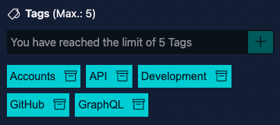
taxonomyLimit | number | Defines the maximum number of items that can be selected. By default set to 0 which allows unlimited items to be selected. | Optional | 0 |
singleValueAsString | boolean | When set to true, a single value will be added as a string value instead of an array. | Optional | false |
InfoWhen a limit is defined, this will get reflected in the UI as well:
{
  "title": "Tags",
  "name": "tags",
  "type": "tags"
}---
tags:
- Development
- GitHub
- GraphQL
- API
---Categories
The categories field is similar to the tags field. Categories are also stored in the
.frontmatter/database/taxonomyDb.json file.
Properties
| Property | Type | Description | Required | Default |
|---|---|---|---|---|
taxonomyLimit | number | Defines the maximum number of items that can be selected. By default set to 0 which allows unlimited items to be selected. | Optional | 0 |
singleValueAsString | boolean | When set to true, a single value will be added as a string value instead of an array. | Optional | false |
{
  "title": "Categories",
  "name": "categories",
  "type": "categories"
}---
categories:
- Development
---Taxonomy
The taxonomy is similar to the tags and categories field, but allows you to define your own
taxonomy values and structure.
Properties
| Property | Type | Description | Required | Default |
|---|---|---|---|---|
taxonomyLimit | number | Defines the maximum number of items that can be selected. By default set to 0 which allows unlimited items to be selected. | Optional | 0 |
taxonomyId | string | Set the id of your custom taxonomy definition defined in the frontMatter.taxonomy.customTaxonomy setting. | Required | |
singleValueAsString | boolean | When set to true, a single value will be added as a string value instead of an array. | Optional | false |
Custom taxonomy
The frontMatter.taxonomy.customTaxonomy setting allows you to provide a list of custom taxonomy
data. Each of the taxonomy data contains a id and an array of options.
Here is an example of the custom taxonomy setting definition:
"frontMatter.taxonomy.customTaxonomy": [
  {
    "id": "customTaxonomy",
    "options": [
      "Option 1",
      "Option 2",
      "Option 3"
    ]
  }
]{
"title": "Custom taxonomy",
"name": "customTags",
"type": "taxonomy",
"taxonomyId": "customTaxonomy"
}---
customTags:
- custom-development
---Fields
The fields field, allows you to create multi-dimensional content type fields (sub-fields). This is
useful when you want to create a complex content type. In case you want to define a list data, you
will have to use the block field.
When you specify the field type as fields, you can define sub-fields in one of two ways:
- Inline, using the
fieldsproperty directly on the field definition. - By reference, using the
fieldGroupproperty to point to a reusable field group defined infrontMatter.taxonomy.fieldGroups.
Properties
| Property | Type | Description | Required | Default |
|---|---|---|---|---|
fields | object[] | Define the sub-fields inline. All the above types are supported. | Required if fieldGroup is not set | |
fieldGroup | string | Reference a field group defined in frontMatter.taxonomy.fieldGroups to use as sub-fields. | Required if fields is not set |
Example 1 - Inline sub-fields
{
"frontMatter.taxonomy.contentTypes": [
{
"name": "multi-dimensional",
"pageBundle": false,
"fields": [
...
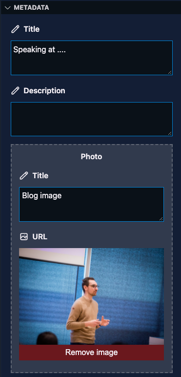
{
"title": "Photo",
"type": "fields",
"name": "photo",
"fields": [
{
"title": "Title",
"name": "title",
"type": "string"
},
{
"title": "URL",
"name": "url",
"type": "image"
}
]
}
]
}
]
}
---
photo:
  title: "Photo 1"
  url: /social/400285cf-4928-4c07-8ca5-158f249a3bc1.png
---
Example 2 - Reusable field group
{
  "frontMatter.taxonomy.contentTypes": [
    {
      "name": "field group test",
      "pageBundle": true,
      "fields": [
        {
          "title": "title",
          "name": "title",
          "type": "string",
          "single": true
        },
        {
          "title": "Dates",
          "type": "fields",
          "name": "dates",
          "fieldGroup": "startAndEndFields"
        }
      ]
    }
  ],
  "frontMatter.taxonomy.fieldGroups": [
    {
      "id": "startAndEndFields",
      "fields": [
        {
          "title": "Date",
          "name": "date",
          "type": "datetime"
        },
        {
          "title": "All Day",
          "name": "allDay",
          "type": "boolean"
        }
      ]
    }
  ]
}---
dates:
date: 2024-01-01T00:00:00.000Z
allDay: true
---FieldCollection
The fieldCollection field type allows you to reuse fields in multiple content types. This is
especially useful when you have a lot of content types and want to reuse the same fields.
Prerequisites
To work with the fieldCollection field type, you need to define a field group (a set of fields for
your data) in the frontMatter.taxonomy.fieldGroups setting.
"frontMatter.taxonomy.fieldGroups": [
  {
    "id": "generalFields",
    "fields": [
      {
        "title": "Title",
        "name": "title",
        "type": "string",
        "single": true
      },
      {
        "title": "Description",
        "name": "description",
        "type": "string"
      }
    ]
  }
]
Properties
| Property | Type | Description | Required | Default |
|---|---|---|---|---|
fieldGroup | string | Define the field group that will be used to create a list of data. | Required |
Example
"frontMatter.taxonomy.contentTypes": [
  {
    "name": "custom page",
    "pageBundle": true,
    "fields": [
      {
        "title": "General",
        "name": "general",
        "type": "fieldCollection",
        "fieldGroup": "generalFields"
      }
    ]
  }
]---
title: "My page"
description: "Page description"
---Block
The block field type allows you to define a group of fields which can be used to create a list of data.
Prerequisites
To work with the block field type, you need to define a field group (a set of fields for your
data) in the frontMatter.taxonomy.fieldGroups setting.
"frontMatter.taxonomy.fieldGroups": [
  {
    "id": "author",
    "labelField": "name",
    "fields": [
      {
        "title": "Author Name",
        "name": "name",
        "type": "string",
        "single": true
      },
      {
        "title": "Social link",
        "name": "social",
        "type": "string",
        "single": true
      }
    ]
  }
]InfoYou can use the same field types as you would use in the regular content types.
Properties
| Property | Type | Description | Required | Default |
|---|---|---|---|---|
fieldGroup | string[] | Define the field group(s) that will be used to create a list of data. | Required |
"frontMatter.taxonomy.contentTypes": [
  {
    "name": "page",
    "fields": [
      {
        "title": "Authors",
        "name": "authors",
        "type": "block",
        "fieldGroup": [
          "author"
        ]
      },
      ...
  }
]ImportantIf you want, you can also create field groupings within the field grouping. This is useful when you want to create sub-groups of data.
---
authors:
  - name: Elio Struyf
    social: https://twitter.com/eliostruyf
    fieldGroup: author
---
Data file
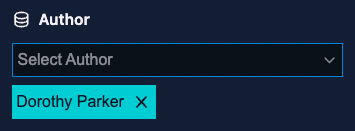
The dataFile field type allows you to use a data file to populate the field with a list of
options. For instance, if you have a data file with all the authors of your site, you can use the
dataFile field type to populate the authors field with the data from the authors data file.
Prerequisites
To use the dataFile field type, you need to have a definition for a data file in place. Here is an
example of the authors sample:
{
  "frontMatter.data.files": [
    {
      "id": "authors",
      "title": "Authors",
      "file": "[[workspace]]/data/authors.json", // Adapt to your needs
      "schema": {
        "title": "Author",
        "type": "object",
        "required": ["name", "url"],
        "properties": {
          "slug": {
            "title": "slug",
            "type": "string"
          },
          "name": {
            "title": "name",
            "type": "string"
          },
          "url": {
            "title": "url",
            "type": "string"
          }
        }
      }
    }
  ]
}
Properties
| Property | Type | Description | Required | Default |
|---|---|---|---|---|
dataFileId | string | Specify the ID of the data file to use for this field. | Required | |
dataFileKey | string | Specify the key of the data file to use for this field. | Required | |
dataFileValue | string | Specify the property name that will be used to show the value for the field. | Optional | |
dataFileAdditionalFields | string[] | Specify additional field names from the data record to store alongside the key field. When set, the frontmatter value will be an object instead of a plain string. | Optional | |
multiple | boolean | Specify if you want to select one or multiple records. | Optional | false |
"frontMatter.taxonomy.contentTypes": [
  {
    "name": "page",
    "fields": [
      {
        "title": "Author",
        "name": "author",
        "type": "dataFile",
        "dataFileId": "authors",
        "dataFileKey": "slug",
        "dataFileValue": "name",
        "multiple": true
      },
      ...
  }
]---
author:
- dorothy-parker
---Storing multiple fields as an object
By default, only the dataFileKey value (e.g. the slug) is stored in the frontmatter. If you need to store multiple fields from the data record as an object, use dataFileAdditionalFields to specify which extra fields to include.
"frontMatter.taxonomy.contentTypes": [
  {
    "name": "page",
    "fields": [
      {
        "title": "Author",
        "name": "author",
        "type": "dataFile",
        "dataFileId": "authors",
        "dataFileKey": "name",
        "dataFileValue": "name",
        "dataFileAdditionalFields": ["slug"]
      },
      ...
  }
]---
author:
name: Elio Struyf
slug: elio-struyf
---When multiple is also enabled, each selected entry will be stored as an object in the array:
---
authors:
  - name: Elio Struyf
    slug: elio-struyf
  - name: John Doe
    slug: john-doe
---
Slug
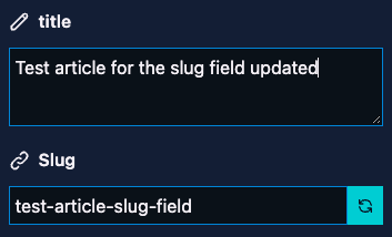
The slug field allows you to create/update the slug of the current page.
Properties
| Property | Type | Description | Required | Default |
|---|---|---|---|---|
editable | boolean | Specify if you allow manual changes, or if the slug is generated automatically. | Optional | true |
{
  "title": "Slug",
  "name": "slug",
  "type": "slug",
  "editable": true,
  "default": "{{slug}}"
}---
slug: version-8-0-0-release-notes
---InfoThe slug is generated based on the title of the page. More information about it can be found in the slug documentation section.
contentRelationship
The contentRelationship field type allows you to create relationships between content. It can for
instance be used to reference an author, or a related blog post.
Properties
| Property | Type | Description | Required | Default |
|---|---|---|---|---|
contentTypeName | string | The name of the content-type to link. | Required | |
contentTypeValue | string | The type of link/value you want to add. This can be slug, or path. | Required | |
sameContentLocale | boolean | Specify if you want to use the same content's locale for the relationship field. | Optional | true |
multiple | boolean | Specify if you want to select one or multiple relationships. | Optional | false |
Example 1
{
  "title": "Session",
  "name": "session",
  "type": "contentRelationship",
  "contentTypeName": "session",
  "contentTypeValue": "slug"
}---
session: /session-slug/
---Example 2
{
  "title": "Session",
  "name": "session",
  "type": "contentRelationship",
  "contentTypeName": "session",
  "contentTypeValue": "slug",
  "multiple": true
}---
session:
- /session1-slug/
- /session2-slug/
---customField
The customField field type allows you to create and add your own fields to render.
ImportantThis is an experimental feature, and might change in the future. To use it, you need to enable the exeperimental features, more information about it can be found in the experimental features section.
Properties
| Property | Type | Description | Required | Default |
|---|---|---|---|---|
customType | string | The name of the custom field type to use. | Required |
{
  "title": "Custom field",
  "name": "customField",
  "type": "customField",
  "customType": "customField"
}
The outcome depends on your custom field implementation.
InfoCheck out registering a custom field for a sample implementation.
Divider
The divider field type allows you to add a divider to your content type. This is useful when you
want to group fields together.
Properties
You only need to specify the type property and name:
{
  "name": "divider",
  "type": "divider"
}
Outcome

Heading
The heading field type allows you to add a heading to your content type. This is useful when you
want to group fields together.
{
  "title": "Section title",
  "name": "sectionTitleWithDescription",
  "description": "This is just a dummy description to test out the field description",
  "type": "heading"
},
{
  "title": "Section title without description",
  "name": "sectionTitleWithoutDescription",
  "type": "heading"
}
Outcome

Feedback/comments
Did you spot an issue in our documentation, or want to contribute? Edit this page on Github!