UI extensibility
As every user has different needs, the Front Matter extension allows you to extend the UI with your own custom elements and components which can be used in the Front Matter dashboards and the panel.
The approach we choose, is to let you register a JavaScript file which will be loaded in the dashboard and panel.
Extensibility points
Front Matter CMS allows you to extend the UI in the following places:
-
Content dashboard
- Image
- Footer
- Draft status
- Date
- Title
- Description
- Tags
-
Panel
- Custom panel view
- Custom fields
Registering a custom UI extension
To start, you will need to create a JavaScript. To make it easier, you need to make use of the @frontmatter/extensibility dependency which makes all the necessary functions available.
import {
  enableDevelopmentMode,
  registerCardImage,
  registerCardFooter,
  registerPanelView,
  registerCustomField
} from "https://cdn.jsdelivr.net/npm/@frontmatter/extensibility/+esm";
Once you have created the JavaScript file, you can register your UI script in
the frontMatter.extensibility.scripts setting as follows:
{
  "frontMatter.extensibility.scripts": [
    "[[workspace]]/.frontmatter/ui/external.js"
  ]
}
The extensibility framework options
Development mode
To enable development mode, you can use the enableDevelopmentMode function. This will allow you to
reload the webview and open the developer tools without the need to reload Visual Studio Code.
enableDevelopmentMode();Once the development mode is enabled, you will see the developer bar at the top of the webview.
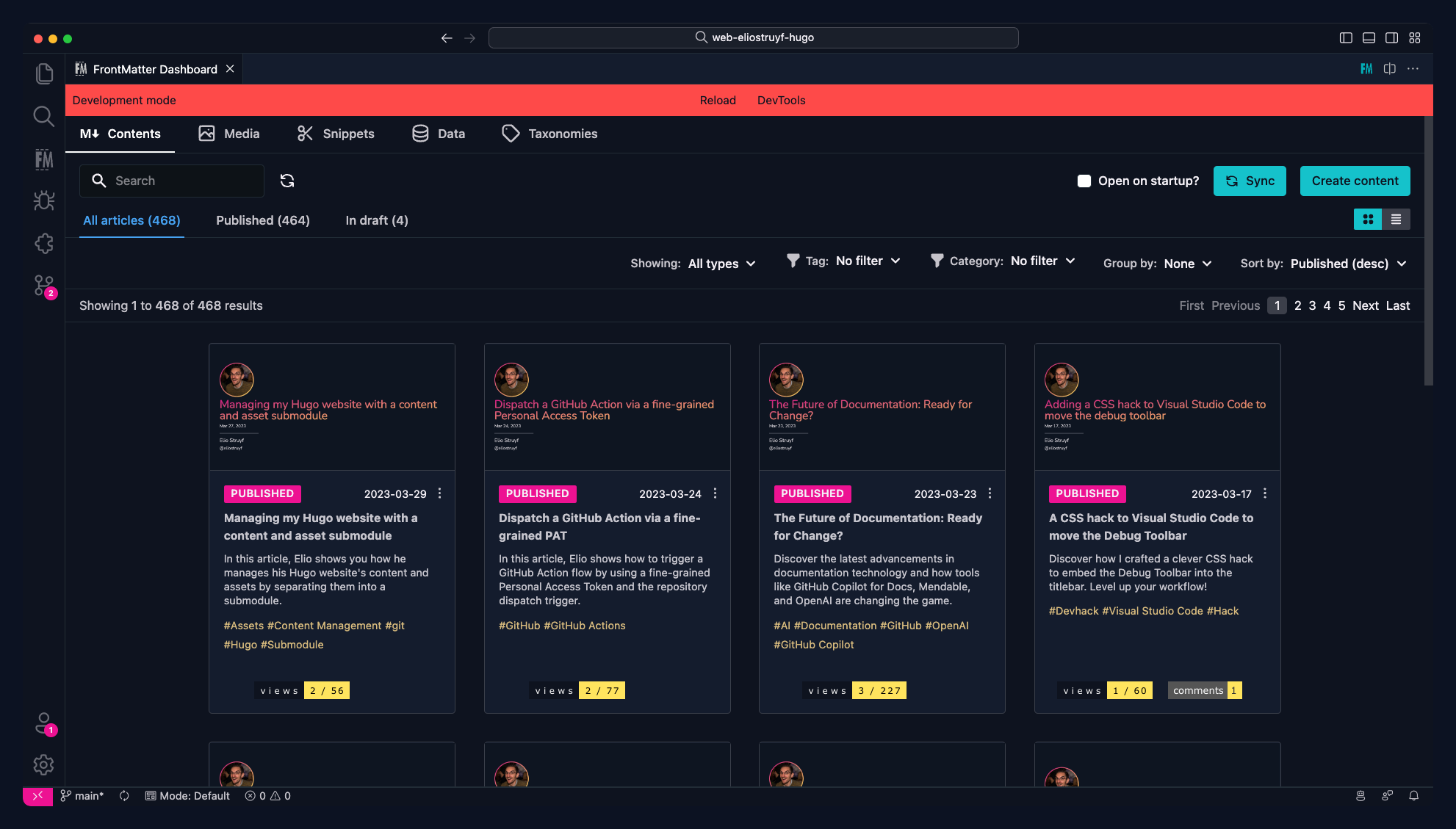
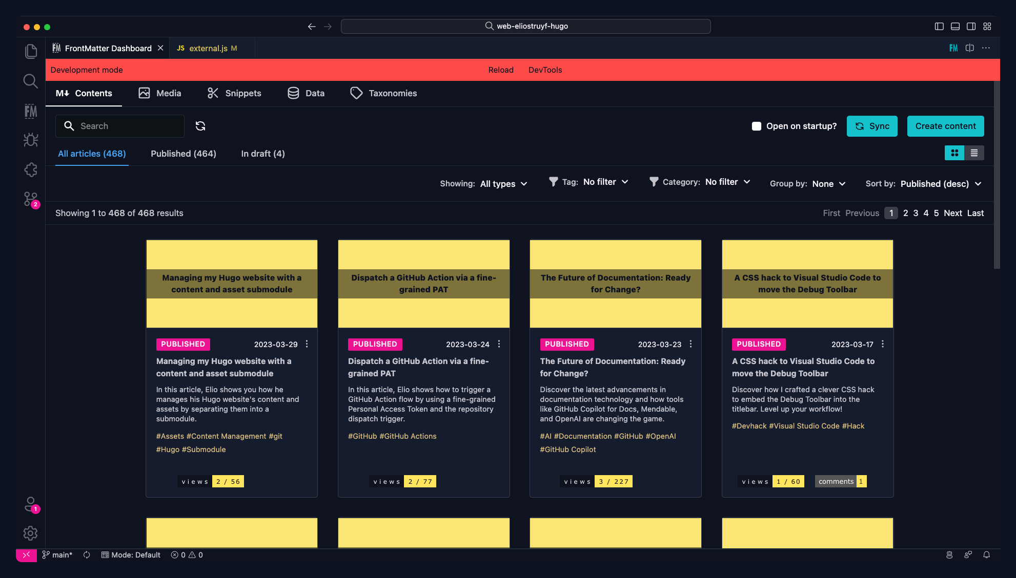
Registering a card image
To register a custom card image, you can use the registerCardImage function. This functionality
allows you to register your own image/element on the content card.
registerCardImage(async (filePath, metadata) => {
  return `<span>Your HTML for the card image</span>`;
});- The
filePathparameter contains the path to the file which is being rendered in the card. - The
metadataparameter contains the metadata (front matter) of the file which is being rendered in the card.- On this metadata object, you can find the
fmPreviewImageproperty which contains the webview URL of the current project. You can use this property to render your own image located in the project.
- On this metadata object, you can find the
Example of a custom image rendering:
Example of using the fmPreviewImage property:
import { registerCardImage, enableDevelopmentMode } from "https://cdn.jsdelivr.net/npm/@frontmatter/extensibility/+esm";
enableDevelopmentMode();
/**
* @param {string} filePath - The path of the file
* @param {object} data - The metadata of the file
* @returns {string} - The HTML to be rendered in the card footer
*/
registerCardImage(async (filePath, metadata) => {
const image = metadata.fmPreviewImage ? metadata.fmPreviewImage : `${metadata.fmWebviewUrl}/relPath/to/fallback.jpg`;
return `<img src="${image}" alt="${metadata.title}" style="object-fit: cover;" class="h-36" />`;
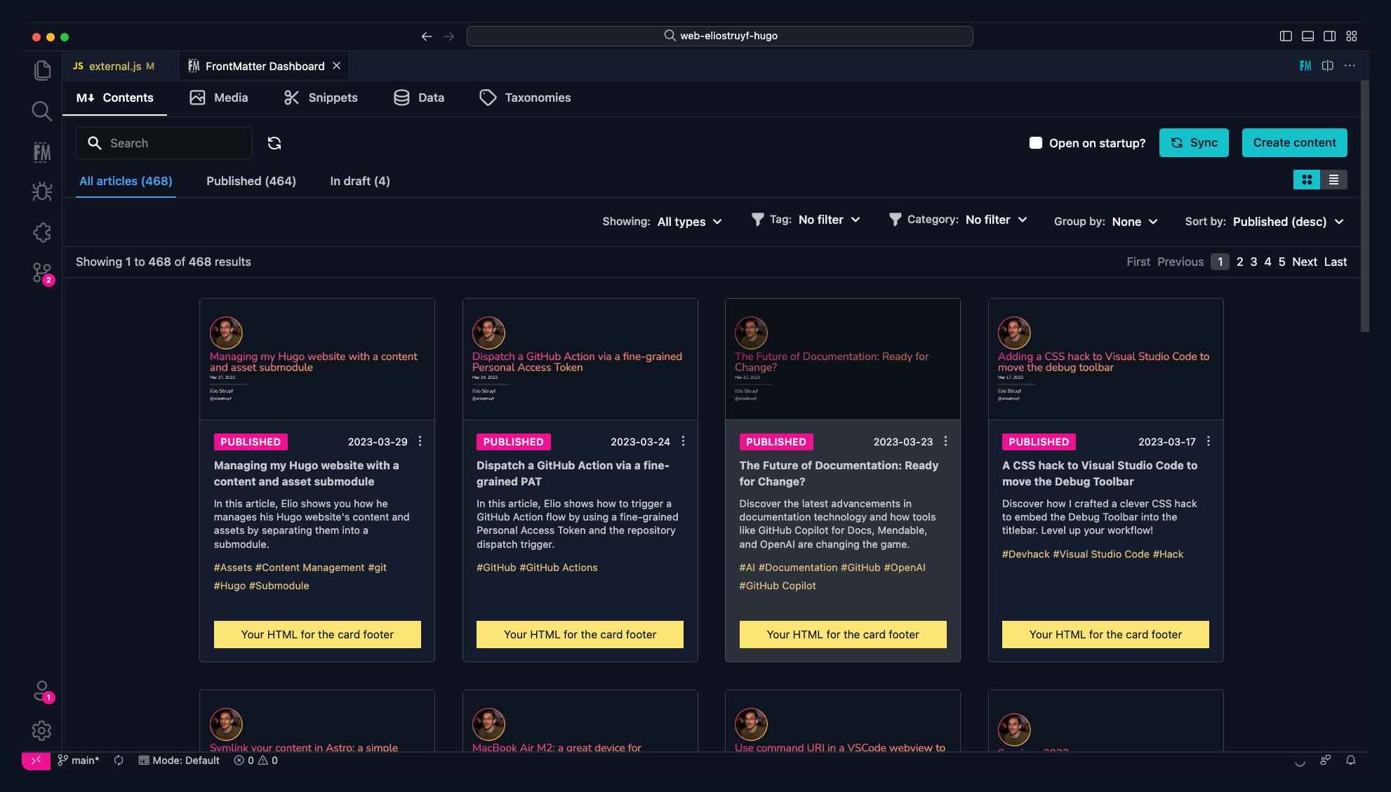
});Registering a card footer
To register a custom card footer, you can use the registerCardFooter function. This functionality
allows you to register your own footer/element which will be rendered at the bottom of the content.
registerCardFooter(async (filePath, metadata) => {
  return `<span>Your HTML for the card footer</span>`;
});
Example of a custom footer rendering:
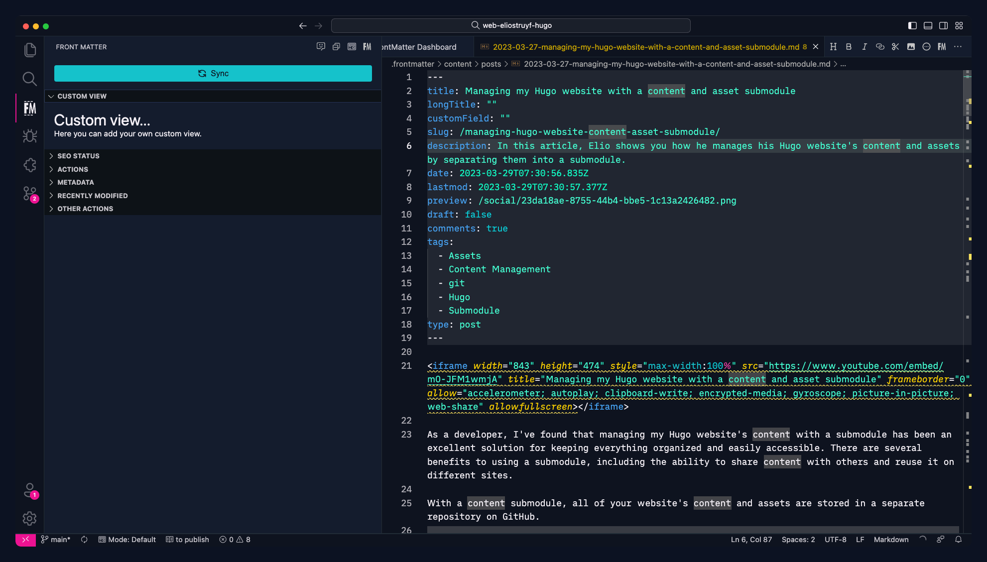
Registering a panel view
To register a custom panel view, you can use the registerPanelView function. This functionality
allows you to register your own panel view which will be rendered in the panel.
registerPanelView(async (metadata) => {
  return {
    title: "Custom View",
    content: `
      <div>
        <h1>Custom view...</h1>
        <p>Here you can add your own custom view.</p>
      </div>
    `,
  };
});
Example of a custom panel view rendering:
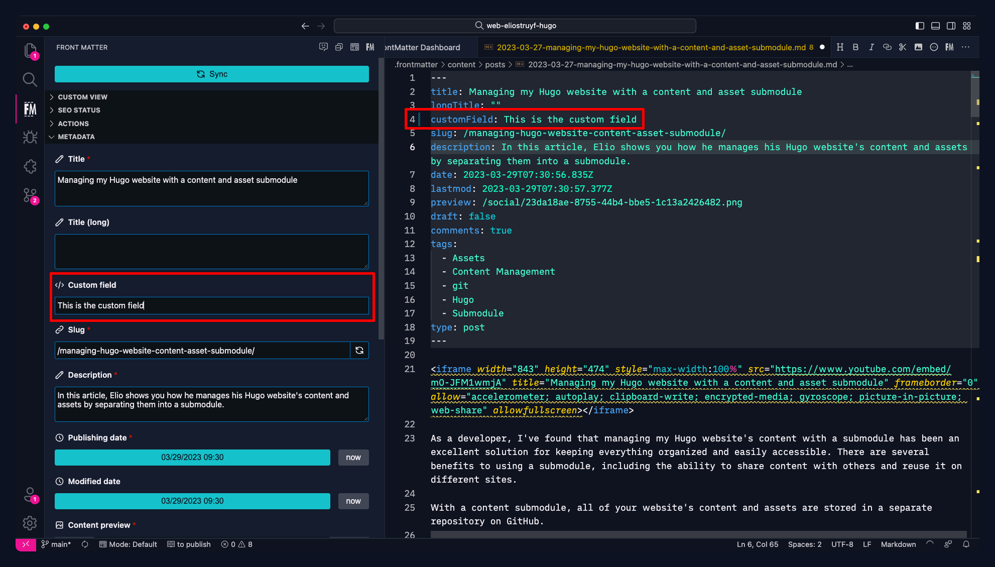
Registering a custom field
To register a custom field, you can use the registerCustomField function. This functionality
allows you to register your own custom field which can be used when editing the front matter.
The custom field requires a bit more work, as it comes with a change handler for the field value updates. To make it easier, it is recommended to use for instance a library like lit to create your custom field.
import { registerCustomField } from "https://cdn.jsdelivr.net/npm/@frontmatter/extensibility/+esm";
import { css, html, LitElement } from "https://esm.run/lit";

let CustomFieldValueChange;

class CustomField extends LitElement {
  static styles = css`
    input {
      border: 1px solid transparent;
      box-sizing: border-box;
      font-family: var(--vscode-font-family);
      padding: var(--input-padding-vertical) var(--input-padding-horizontal);
      color: var(--vscode-input-foreground);
      outline: none;
      background-color: var(--vscode-input-background);
      width: 100%;
    }

    input:focus {
      border: 1px solid var(--vscode-inputValidation-infoBorder);
    }
  `;

  static properties = {
    inputValue: {
      type: String,
    },
  };

  constructor() {
    super();
    this.inputValue = "";
  }

  _internalChange(e) {
    this.inputValue = e.target.value;
    CustomFieldValueChange(e.target.value);
  }

  render() {
    return html`
      <input
        type="text"
        value="${this.inputValue}"
        @change=${(e) => this._internalChange(e)}
      />
    `;
  }
}
customElements.define("custom-field", CustomField);

/**
 * @param {string} name - The name of the custom field to use in the content-type
 * @param {function} callback - The callback that will be used for rendering the
 * custom field
 */
registerCustomField("customTextField", async (value, onChange) => {
  // Bind the event handler for the onChange evet
  CustomFieldValueChange = onChange;
  // Return the HTML of the custom field
  return `
    <custom-field inputValue="${value || ""}"></custom-field>
  `;
});
Once this script has been registered, you can use the customField type in your content-type.
Register it as follows:
{
  "frontMatter.taxonomy.contentTypes": [{
    "name": "default",
    "pageBundle": false,
    "fields": [
      ...
      {
        "title": "Custom field",
        "name": "customField",
        "type": "customField",
        "customType": "customTextField"
      }
    ]
  }]
}
Example of a custom field rendering:
Feedback/comments
Did you spot an issue in our documentation, or want to contribute? Edit this page on Github!